Explore dashboards and data storytelling based on real-world cases, created in tools such as Power BI, Tableau, Python and Excel
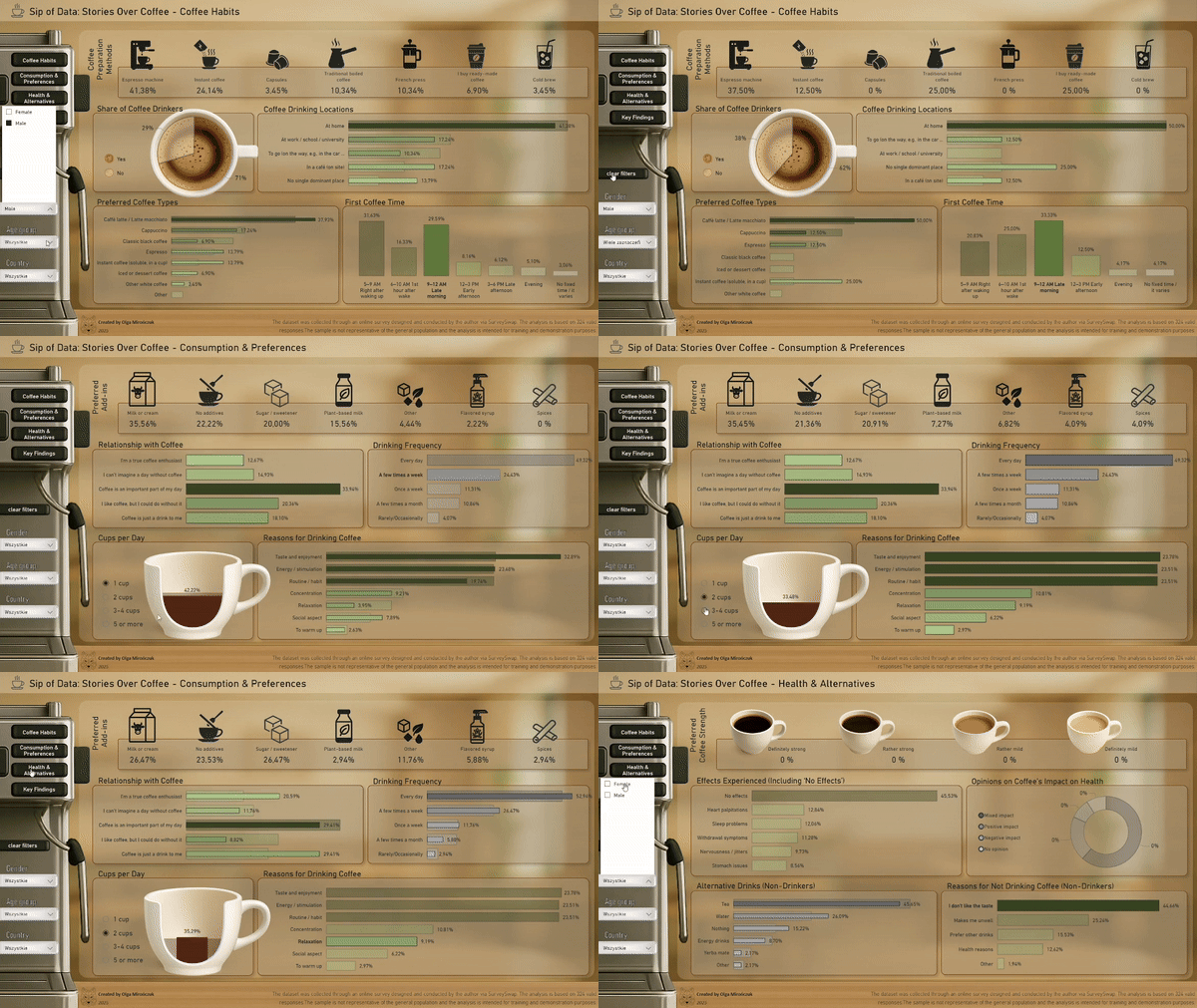
Project: Data Sip: Coffee consumption dashboard
Project: A sip of data: Coffee consumption dashboard
Tools: Power BI, Power Query, Python (Pandas), Excel
Description: Analiza danych ankietowych o nawykach picia kawy - od czyszczenia i transformacji po budowę interaktywnych wizualizacji.
Objective: Understanding consumer preferences and storytelling in a dashboard with dynamic filters (age, gender, country).
Data: 324 responses | SurveySwap
Repository:  See on GitHub
 www.youtube.com - Sip of Data: Stories Over Coffee
 A cookie with your coffee?