
Project: A sip of data: Coffee consumption dashboard
Tools: Power BI, Power Query, Python (Pandas), Excel
Description: Analysis of survey data on coffee drinking habits - from cleaning and transformation to building interactive visualizations.
Objective: Understanding consumer preferences and storytelling in a dashboard with dynamic filters (age, gender, country).
Data: 324 responses | SurveySwap
Repository:  See on GitHub
 www.youtube.com - Sip of Data: Stories Over Coffee
Introduction
I love coffee - it's my daily ritual and source of energy. Therefore, it was a natural choice to dedicate the first project in my portfolio to coffee. I like to call it my „first latte in the world of data analytics.”.
This project was not just about analyzing the answers, but also about seeing what I could do with the tools and with design. That's why the dashboard is more artistic in nature - it was my experiment with shapes, colors and interactivity.
📌 In my professional work, I know that dashboards should be clear, practical and quick to build. In this project I focused on creativity and learning - I treat it as an exercise in storytelling with data.
Data
- Source: a survey designed by me, collected online (SurveySwap)
- Number of responses: 324
- Scope / Topics covered: coffee drinking frequency, type of coffee, favorite add-ons, reasons for drinking (enjoyment, energy, focus), and context (work, studying, meetings).
📌 Important: the data is not representative of the entire population - it comes from an online group of respondents. The goal was not statistics, but to practice the full process of data analysis.
Process
This was my first major project where I went through the whole cycle - from idea, to data collection, to the final interactive report.
- Dashboard - The final step was to create an interactive report where users can filter data by age, gender and country and compare groups.
- Draft survey - I prepared questions about daily coffee habits: how often, in what situations, with what additives and why.
- Gathering responses - The online survey yielded 324 responses. I knew the sample was not representative, but it provided a great exercise.
- Data cleaning and preparation - I left the country question open on purpose. I wanted to see what it was like to work with the answers written in different ways („USA”, „United States”, „US”). It was time-consuming, but very informative. Other questions - such as age or allowances - were closed, so the analysis was simpler.
- Structuring and preliminary analysis - After cleaning, I could finally see the full picture. A raw table with hundreds of rows doesn't tell you much - only after grouping and visualizing the data could the main patterns be seen.
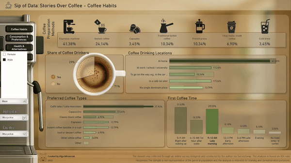
Results
The dashboard shows coffee drinking habits in a simple and clear way. The responses mostly confirmed the intuitions, but the value of the project was to convert these habits into numbers and allow them to be compared.
- Almost half of the respondents drink coffee daily,
- 44% usually drinks only one cup a day,
- additives are very popular - usually milk or cream,
- The main reasons for drinking coffee: pleasure, energy and concentration.
Thanks to the interactive nature of the project, the results can be explored from different perspectives — for example by gender, age, or country.
Reflections
This project taught me that data analysis is not just about the tools, but also about the questions, the way the survey is designed and the careful preparation of the data.
Key findings:
- The type of question has a huge impact on the subsequent analysis,
- The data needs to be cleaned and grouped before it shows a clear picture,
- Not every project brings surprising discoveries - sometimes the goal is simply to show intuition in numbers.
This was my first full project - from the idea, to my own survey, to the finished dashboard. It gave me practice and reassured me that this field was my direction of development.


 A cookie with your coffee?