
Project: Airline Passenger Satisfaction Analysis
Tools: Excel (PivotTables, Charts), VBA, Conditional Formatting
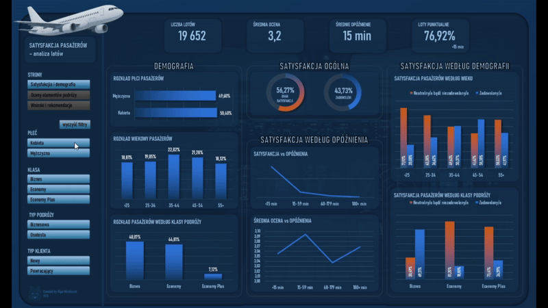
Description: An analytical project based on an airline passenger satisfaction survey covering 19,652 responses. The analysis focuses on identifying the factors that influence the overall travel rating and the differences in satisfaction across passenger segments.
Objective: Understanding which aspects of the journey have the greatest impact on passenger satisfaction and identifying areas that require improvement to enhance the overall customer experience.
Data: Training materials (dataset provided as part of the course).
Repository:  See on GitHub
Introduction
Oceny satysfakcji pasażerów pokazują nie tylko subiektywne wrażenia z podróży, ale także jakość procesów obsługi i przebiegu lotu. Ten projekt powstał jako ćwiczenie analityczne i miał na celu uporządkowaną analizę ankiet pasażerskich oraz identyfikację wzorców, które wpływają na ogólną ocenę lotu.
The dashboard was designed to present satisfaction not as a single average, but as a set of segment-dependent relationships. The analysis explores how ratings vary by travel class, customer type, purpose of travel, demographics, and delays. The focus was on creating a clear and restrained visual design that supports interpretation and comparison across groups, rather than reducing the results to a single metric.
The project covered the full data preparation process and the development of an interactive analytical tool in Excel.
Data
- Scope of analysis: It includes 19,652 survey responses.
- Data source: The data comes from the training dataset “Sky Is The Limit”, provided as part of the course. The materials did not include a publicly available primary data source.
- The data was provided in a tabular format and included, among others:
- Passenger demographic information
- Customer type
- Type and purpose of travel
- Travel class
- Flight distance
- Delays
- oceny poszczególnych elementów podróży, takich jak komfort, obsługa, boarding czy WiFi.
Process
1) Data preparation and modeling in Excel
- The analysis was conducted in Excel using worksheets that document each stage of the process.
- The key steps included cleaning and standardizing the survey data, creating derived variables, restructuring rating fields into a format suitable for factor analysis, and building supporting tables for Top 3 and Bottom 3 comparisons. Maintaining a consistent aggregation logic was essential so that all visualizations were based on the same metric definitions.
- The visualizations were based on pivot tables designed to enable dynamic filtering and comparison across segments.
2) Visualization and interaction in the dashboard
- The dashboard was designed as an exploratory tool that supports interpretation and comparison, rather than as a static report.
- The structure includes an overview page showing overall satisfaction and demographics, as well as a factor analysis page presenting ratings of travel components and comparisons between segments and the overall score.
- I used KPI tiles, column and line charts, a donut chart, and a radar chart that shows the profile of a selected segment against the overall average.
- The results can be filtered using slicers. In addition, I implemented a VBA-based button to reset all filters.
- The layout and color scheme were selected with a focus on readability, comparability, and visual consistency.
Results
- Analiza pokazała niski ogólny poziom satysfakcji pasażerów oraz silne różnice między segmentami. Widoczny był duży wpływ klasy podróży na poziom zadowolenia, a także istotny spadek satysfakcji wraz ze wzrostem opóźnień. Różnice były również wyraźne między podróżami służbowymi i prywatnymi.
- The lowest-rated areas were Wi-Fi, the booking process, and punctuality.
- Dashboard umożliwia szybkie porównanie segmentów oraz identyfikację elementów podróży, które najsilniej obniżają ocenę lotu.
Reflections
- The biggest challenge was not the visualization itself, but maintaining a consistent analytical logic across multiple segmentation dimensions. It was crucial to define metrics consistently, ensure comparability of results across charts, and strike a balance between detail and readability.
- Projekt ma charakter demonstracyjny, ale pokazuje sposób myślenia analitycznego oraz podejście do projektowania dashboardu jako narzędzia wspierającego interpretację i decyzje.


 A cookie with your coffee?