Project: Seasonality of Farmer Questions in East Africa (2019–2020)
Tools: Python (pandas), Tableau, Excel / Power Query
Description: Analysis of multilingual farmers’ questions (WeFarm) to identify recurring seasonal patterns in crop production, plant diseases, fertilization, and market prices.
Objective: Understanding farmers’ activity cycles and information needs, and translating them into operational insights (timely planning of content, campaigns, and communication).
Data: Anonymized data shared as part of the DataKind Challenge; raw data is not included in the repository.
Repository:  See on GitHub
Introduction
Questions asked by smallholder farmers provide insights not only into their immediate challenges, but also into seasonal cycles of work, production, and demand for knowledge. This project was developed as part of my DataKind analytics volunteering work (Producers Direct DataKit Challenge) and gave me the opportunity to analyze multi-year data in a structured, transparent way, with a strong focus on identifying recurring patterns.
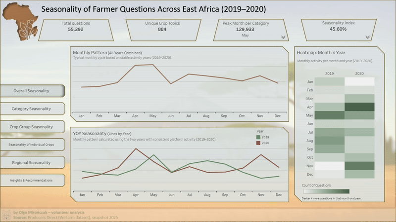
The dashboard was designed to present seasonality not as isolated spikes in activity, but as recurring patterns: when farmers ask about planting, crop diseases, fertilization, or market prices; how these needs shift throughout the year; and how they differ across regions. I aimed for a calm, clear visual style — an analysis that helps understand the rhythm of the data and its operational context, rather than reducing the phenomenon to a single metric. The project combined conceptual work with the full data preparation process and the development of an analytical tool.

DataKind Certificate confirming participation in an international volunteer data analytics project.
Data
- Scope of analysis: 2017–2024 (taking into account varying year-to-year completeness)
- Data source: Anonymized WeFarm data shared with DataKind Challenge participants by Producers Direct.
- The data was provided in a tabular format and included, among others:
- record identifiers,
- timestamps (year, month),
- country and language information,
- short text-based farmer questions,
- technical platform metadata.
The key element of the analysis was the text content, which required further thematic classification. In line with DataKind guidelines, the source data and resulting output tables (aggregations) are not publicly shared. The repository includes the analytical code, process documentation, and supporting artifacts used in the pipeline.
Process
1) Data Preparation and Classification (Python)
- The data was processed in Python using notebooks that document each stage of the pipeline.
- Key steps:
- cleaning and standardizing time-related fields,
- validating metadata consistency (countries, languages),
- preparing text content for classification,
- building and iteratively expanding a semantic dictionary,
- semi-automated thematic classification (human-in-the-loop),
- preparing data for seasonal aggregation.
- The pipeline produced an aggregated pivot-style table (metric: number of questions), which was then used as the data source in Tableau. The pivot file is not publicly available; the repository includes a description of its structure and the process used to generate it.
- Due to the multilingual nature of the dataset and the lack of complete translation resources, the analysis was not based on translating all content into a single language, but rather on frequency patterns and the timing of topic occurrences.
2) Visualization (Tableau)
- The dashboard was designed as an interpretative tool rather than a static report.
- The structure includes:
- an overview of overall activity and question volume,
- sezonowość kategorii tematycznych w ujęciu miesięcznym,
- regional comparisons,
- a summary of key patterns and potential operational applications.
- Key elements used:
- KPIs describing scale and seasonality,
- monthly trend charts,
- heatmaps (month × year),
- interactive filters (time, region, category),
- tooltips explaining context and data limitations.
- The layout and color palette were chosen to support clarity and comparability, without overemphasizing individual months or categories.
Results
- The analysis revealed, among others:
- clear, recurring seasonal patterns for key topics,
- differences in query rhythms across regions,
- a concentration of planting- and crop-disease-related questions in specific periods of the year,
- the potential to use seasonality to better plan communication and advisory content.
- The dashboard enables analysis of these patterns over time and comparison across categories and regions, without requiring access to the source data.
Reflections
- The biggest challenge was working with multilingual text data rather than the visualization itself. Key elements included:
- clear category definitions,
- deliberate methodological decisions,
- manual quality control of the classification.
- Projekt wymagał ciągłego balansowania między szczegółowością a czytelnością. Zamiast maksymalnej precyzji w każdym punkcie, priorytetem była spójność procesu i możliwość interpretacji wyników przez osoby nietechniczne. Analiza miała wspierać decyzje operacyjne, a nie tworzyć narrację opartą na pojedynczych ekstremach.

 A cookie with your coffee?