
Project: Training activity and progress analysis (April–November 2025)
Tools: Tableau, Power Query, Excel
Description: A project completed as part of the KajoDataSpace Challenge #04. It uses real-world training data, covering both strength training and cardio.
Objective: Understanding and visualizing movement habits through data. Revealing cycles, comebacks, intensity fluctuations, and trends that are usually invisible day to day. The project emphasizes that everyday numbers form a clear story – and can become a tool that supports growth.
Data: An authentic training tracker by Kaja Rudziński (shared by KajoData / KajoDataSpace for competition purposes).
Repository:  See on GitHub
  See recommendations from Kaja Rudziński
Introduction
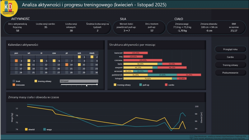
Training data can reveal more than feelings alone. It helps you understand what your movement, consistency, and progress truly look like. This project was created as part of the KajoDataSpace Challenge #04 and gave me the opportunity to analyze several months of my activity log in a structured, objective, and transparent way.
The dashboard I created is designed to tell the story of effort not through “personal records,” but through patterns: how training volume changed over time, when cardio increased, which muscle groups were most heavily loaded, and how these shifts translated into changes in the body. I wanted the visualizations to feel calm, clear, and free from unnecessary drama — an analysis that helps to understand rather than judge. This wasn’t just a visualization project, but also a process of careful data preparation and hands-on work with multiple data sources: from dumbbell and barbell workouts, through cardio sessions, to body weight and measurement tracking.
Data
- Scope of analysis: April – November 2025
- Data source: training dataset provided by Kaja Rudziński as part of the KajoDataSpace Challenge #04.
- The datasets include, among others:
- date and time of activity,
- exercise name, number of sets and repetitions,
- weight used (dumbbells, barbell),
- cardio distance and duration (elliptical),
- maximum pull-up count,
- body weight and selected body measurements,
- manual comments on training sensations.
The data varied in level of detail and format depending on the type of activity, so standardizing it was a separate and important step. The goal of this project was clarity and structure — not creating a “motivational narrative” or comparing results.
Process
1) Data preparation (Power Query)
- All .csv files were imported and cleaned following one consistent standard.
- Key steps:
- removing empty rows and duplicate entries,
- standardizing date and time formats,
- standardizing column names (day, exercise, reps, weight_kg, time),
- converting values to appropriate data types (date, time, integer, text),
- merging data from different sources while maintaining consistent structures,
- manual mapping of exercises to muscle groups (e.g., shoulders, back, legs),
- calculating training volume (sets × reps × weight),
- cleaning comments and converting them into binary indicators (e.g., “near_failure”, “muscle_soreness”).
I also created derived fields needed for later visualization, including the average load level by muscle group and training volume calculated within time windows.
2) Visualization (Tableau)
- The dashboard consists of four pages:
- Year overview – activity, training volume, training calendar, and changes in weight and body measurements,
- Cardio – elliptical duration, calories burned, and efficiency,
- Strength training – weekly volume and a body diagram showing muscle group load,
- Summary – key patterns and insights.
- Key elements used:
- KPIs for active days, training volume, and performance results,
- trend charts for cardio and strength training,
- muscle load distribution (based on the last 3 workouts for each muscle group),
- activity calendar,
- highlight charts and bar charts,
- interactive filters (date, activity type, muscle group).
The color palette and layout were designed with readability in mind and to stay consistent with the visual identity of the challenge. The colors reference the logo KajoDataSpace.
Results
- A few key insights from the dashboard:
- activity was consistent, but its intensity varied depending on the month,
- the highest muscle load was observed in the groups trained most frequently (e.g., back and legs),
- cardio efficiency improved over time (more calories burned in less time),
- strength training volume showed clear periods of increase and decrease,
- zmiany wagi i obwodów następowały stopniowo, zgodnie z trendami aktywności.
The interactive dashboard makes it possible to track these patterns over time and compare different types of activity side by side.
Reflections
- The biggest challenge was the data — not the visualization.
- Each type of activity used a different way of recording information — from barbell workouts and cardio sessions to written comments. Standardizing everything into one structure required:
- precise exercise mapping,
- format cleanup and standardization,
- splitting complex fields into numerical values and qualitative indicators.
- Clear definitions help prevent misinterpretation.
- In this project, “training volume” is defined as reps × sets × weight.
- For dumbbell exercises where the weight was recorded per hand, the value was additionally multiplied by ×2 to reflect the total load used.
- I avoided ranking “the strongest muscle groups” or using dramatic colors, focusing instead on trends and balance rather than comparison.

 A cookie with your coffee?