Explore dashboards and data storytelling based on real-world cases, created in tools such as Power BI, Tableau, Python and Excel
-
Warkan – a Cost-Efficient AI Assistant for the Blog
Read more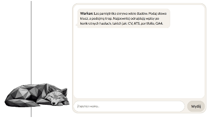
Project: Warkan – a Cost-Efficient AI Assistant for the Blog
Tools: Python, FastAPI, scikit-learn (TF-IDF), REST API, WordPress API, Cloudflare Workers AI
Description: A custom blog chatbot built on a Retrieval-Augmented Generation (RAG) architecture that combines semantic search with responses generated by a language model.
Objective: The goal was to build an assistant that answers only using the blog’s real content, while maintaining control over context, system logic, and the cost of model queries.
Data: The data is sourced from blog posts dynamically fetched through the WordPress REST API.
Repository: See on GitHub
 -
Airline Passenger Satisfaction Analysis
Read more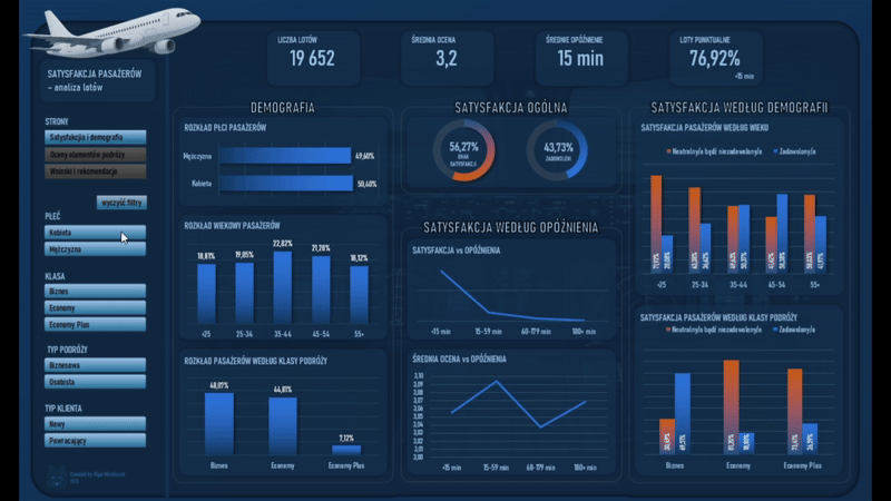
Project: Airline Passenger Satisfaction Analysis
Tools: Excel (PivotTables, Charts), VBA, Conditional Formatting
Description: An analytical project based on an airline passenger satisfaction survey covering 19,652 responses. The analysis focuses on identifying the factors that influence the overall travel rating and the differences in satisfaction across passenger segments.
Objective: Understanding which aspects of the journey have the greatest impact on passenger satisfaction and identifying areas that require improvement to enhance the overall customer experience.
Data: Training materials (dataset provided as part of the course).
Repository: See on GitHub -
Training activity and progress analysis (April–November 2025)
Read more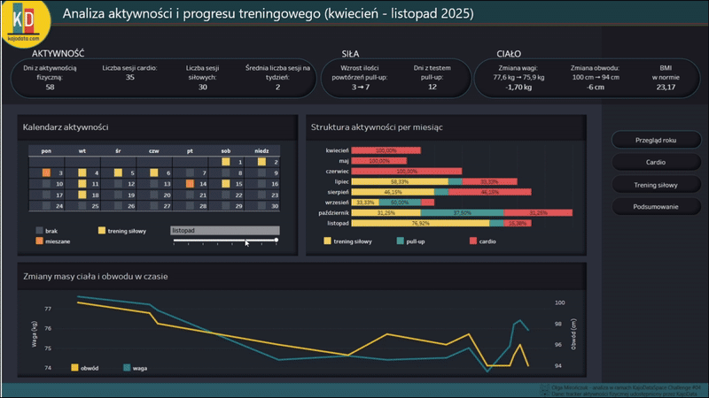
Project: Training activity and progress analysis (April–November 2025)
Tools: Tableau, Power Query, Excel
Description: A project completed as part of the KajoDataSpace Challenge #04. It uses real-world training data, covering both strength training and cardio.
Objective: Understanding and visualizing movement habits through data. Revealing cycles, comebacks, intensity fluctuations, and trends that are usually invisible day to day. The project emphasizes that everyday numbers form a clear story – and can become a tool that supports growth.
Data: An authentic training tracker by Kaja Rudziński (shared by KajoData / KajoDataSpace for competition purposes).
Repository: See on GitHub  See recommendations from Kaja Rudziński
 -
Seasonality of Farmer Questions in East Africa (2019–2020)
Read more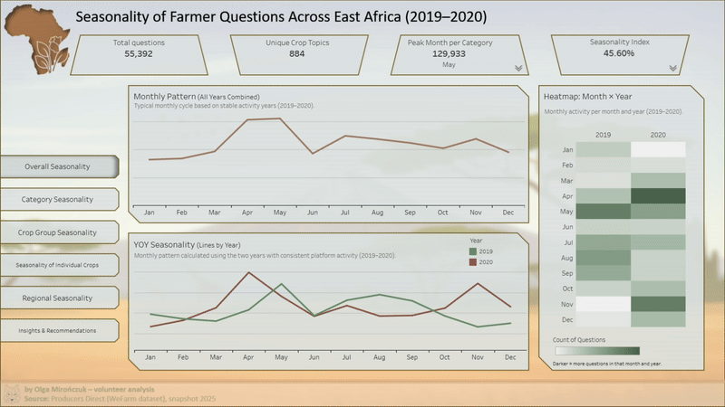
Project: Seasonality of Farmer Questions in East Africa (2019–2020)
Tools: Python (pandas), Tableau, Excel / Power Query
Description: Analysis of multilingual farmers’ questions (WeFarm) to identify recurring seasonal patterns in crop production, plant diseases, fertilization, and market prices.
Objective: Understanding farmers’ activity cycles and information needs, and translating them into operational insights (timely planning of content, campaigns, and communication).
Data: Anonymized data shared as part of the DataKind Challenge; raw data is not included in the repository.
Repository: See on GitHub -
Advent Calendar 2025 (Excel + VBA)
Read more
Project: Advent Calendar 2025 (Excel + VBA)
Tools: Microsoft Excel (UI), VBA (logic), GitHub (repo + documentation)
Description: A custom Advent calendar built as a mini offline application in Excel. The project combines a user interface (clickable windows/postcards), time-based logic, and persistent saving of the application state.
Objective: Building a cohesive application in Excel/VBA with date-based access control, persistent state, game rules, and logic separated from the UI layer.
Data: No classic analytical dataset – this is an application-style project (event-driven UI, control table, persistent state).
Repository: See on GitHub Promotion partner: KajoData(discount code hidden in the calendar) -
Volunteer project: shark incidents • 2000-2024
Read more
Project: Shark incidents • 2000-2024
Tools: Tableau, MySQL (ETL), DBeaver
Description: Independent, pro bono analysis based on the Global Shark Attack File (GSAF) – from importing and cleaning data (ETL in MySQL) to building an interactive dashboard in Tableau.
Objective: Education and context, not fear – emphasizing seasonality, human activity and geography (with clear definitions: fatal vs non-fatal and unprovoked).
Data: Global Shark Attack File (GSAF) • snapshot 2025-09-24 • incidents 2000-2024.
Repository: See on GitHub  View the reference letter from GSAF
 -
Project: Data Sip: Coffee consumption dashboard
Read more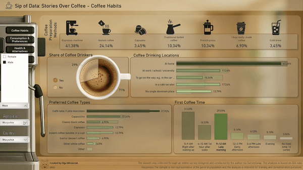
Project: A sip of data: Coffee consumption dashboard
Tools: Power BI, Power Query, Python (Pandas), Excel
Description: Analysis of survey data on coffee drinking habits - from cleaning and transformation to building interactive visualizations.
Objective: Understanding consumer preferences and storytelling in a dashboard with dynamic filters (age, gender, country).
Data: 324 responses | SurveySwap
Repository: See on GitHub
 www.youtube.com - Sip of Data: Stories Over Coffee
 A cookie with your coffee?